Looking to avoid common magazine layout mistakes? Being a magazine designer can be hard work. Like most creative positions, the layout and design of your product are open to interpretation and reinvention.
In fact, there are generally no hard and fast rules when it comes to what you create. However, this means that it can be just as easy for a project to go awry with common magazine layout mistakes when certain expectations are not met.
Here at Dazzle Printing, we have had over 35 years of experience in magazine printing and publishing. During this time, we have picked up on many common magazine layout mistakes that only come to light after projects are submitted for print. To avoid these, we have compiled an easy guide to common magazine layout mistakes to look out for.
Common Magazine Layout Mistakes — Typesetting
If your magazine has text of any kind, it is important to invest in a few fonts that are legible, aesthetic, and reliable when it comes to your magazine design. This might seem simple, but the fact is that there are hundreds of fonts on any desktop publishing software and even more that are available for download or customization.
You might find yourself with tons of choices and even drawn to certain aesthetic styles, however, make sure to use a sense of practicality when it comes to choosing your font. Sometimes, oldies like Times New Roman and Garamond might be the best option.
Column Width
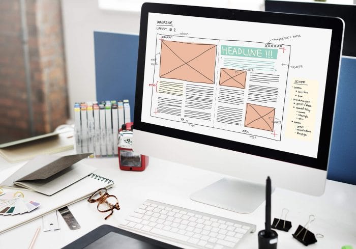
If you are having lengthy interviews and articles in your magazine, it might be best to break up the blocks of text into multiple columns. This can help with making your content more user-friendly and easier to read. However, it is crucial that you do not set your columns too close together or too far apart as this can have the opposite effect.
Proofreading
Even if you are working with an established author, make sure to proofread the content and do not rely just on the spell-check of the software you use. Nothing is more unprofessional than bad spelling and it can be a costly mistake if it is not caught before multiple print copies are made.
Common Magazine Layout Mistakes — Images
Most magazines will have a large number of photographs, graphics, and other design elements. It is important that you crop these images to get the best composition. Another thing to consider is the color scheme and paper type of the final product. Different paper qualities will bring out different types of colors and design elements, and it is important to make the best choice to emphasize the elements you want to avoid common magazine layout mistakes.
Get Reliable Printing Services with Dazzle Printing
On top of these different considerations, there are also more printing-specific elements that designers have to take into account like binding, margins, cover types, lamination, and even the overall dimensions and materials used.
Even for the most experienced of designers, it can be hard to have a comprehensive understanding of what new printing services are available and what alternatives are best for your specific project.
Our team is able to help. For more information on magazine printing, free printing sample packages, or other types of print media, contact us today.


