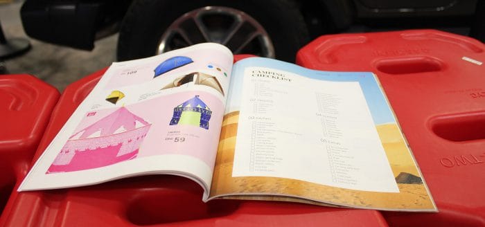
With the unyielding advancement of technology continuing to pick up pace, it is incredible that product catalog design, which was thought to be obsolete just a few years ago, have made a big comeback. Over the last few years, more and more businesses are printing them, and their impact cannot be ignored. Statistics from the U.S. Postal Service revealed that three out of four Americans became more interested in a retailer’s products after coming across them in a product catalog, and four out of five have made purchases as a result.
Despite the importance of product catalogs, not every business that has used them as part of their marketing strategy have encountered success. Why? The reason is pretty straightforward, their product catalogs are poorly designed and formatted. In order for your product catalogs to successfully attract consumers, they have to be of a certain standard. Read on to find out more about the common mistakes to avoid when designing a product catalog.
Inappropriate Use of Headlines
The headline is the first thing a potential consumer will notice when picking up your product catalog design. It is crucial to come up with an attention-grabbing, catchy headline, yet many product catalogs make the mistake of being too boring and dour. Some of them are unnecessarily convoluted, as retailers try to incorporate too much information, such as the product description, into the headline. The wordiness puts off consumers from reading. An ideal headline should be one which is not only short and sweet, but also catchy enough to warrant the reader’s continued attention.
Inappropriate Use of Company Logo
Potential consumers are far more likely to read your print catalog if they recognize which company the product catalog design is from. Therefore, it is important that your company’s logo be placed on the front of your product catalog design. It should also be larger in size than any other words on the cover. Ensure that there is a sharp contrast between the background of your cover and the logo, making it stand out further. Often, retailers have their logos consigned to a tiny corner of the cover, while a glamorous model dolled up in their latest wears takes centerstage. This shifts the attention away from your company and onto the model instead.
Product Catalog Design Cost Cutting
Too often, retailers clutter their pages with many products, allowing them to reduce the cost of producing the product catalog design. This result is a visually unappealing design, as the products and their descriptions are cluttered together. Most readers do not have the patience to read and scour through every morsel of information on the page, and if they do not read about your products, they most certainly aren’t going to purchase them, adversely impacting your sales.
If you or your company are looking to get your product catalogs printed, Dazzle Printing is here for you. We have helped thousands of satisfied clients over the years, impressed by the high-quality, yet low-cost catalog printing services we offer. We do so without compromising on turnaround time, ensuring that you can get your product catalogs printed as quickly as you require.


