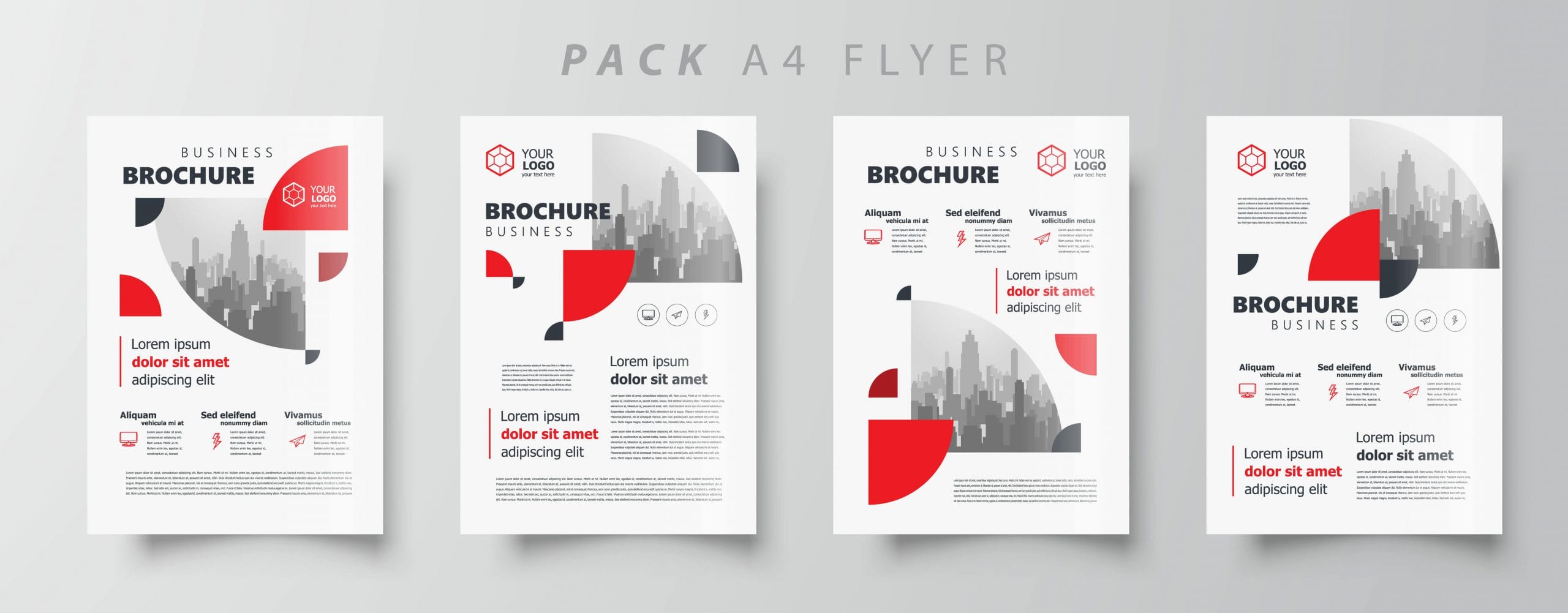
Make sure you don’t make common brochure mistakes. Do you remember the last time you received a brochure and threw it aside immediately after taking a quick glance? If you’re planning to create a brochure to promote a business or event, you don’t want it to end up like one of the other brochures that most throw aside because of brochure mistakes.
As such, before designing your brochure, you first need to understand what some common brochure mistakes are. By avoiding these brochure mistakes, your readers will more likely be hooked to your content and want to find out more information.
Lack of Reader Perspective
The best way to judge the effectiveness of your brochure is to put yourself in the shoes of your reader. Consider what would grab your attention. If you feel that your personal judgment might be biased, simply ask a trusted friend or family member for their take.
If you feel that your brochure will appear uninteresting to your target audience, clearly there is a lack of an attention-grabbing factor. You should always ensure that the benefits that readers stand to gain are made clear just from one glance at your brochure. By identifying what there is to gain, readers are much more likely to be enticed and want to find out more about the information contained in the brochure.
Apart from that, you should also ensure that the design of your brochure is not dull. What this means is that you should avoid using too many neutral colors such as light shades of grey. By comparison, using vibrant colors is a better option to grab the attention of readers.
Brochure Mistakes: Boring Content
Even if your brochure has that one wow factor that grabs the attention of your readers, you still need to follow that up with engaging content or you will make classic brochure mistakes. Many brochures make the mistake of using headlines that over-promise but aren’t backed up by the remaining content in the brochure.
Avoid having too many words in the brochure as the attention span of a typical reader tends to be extremely short. Instead, focus on important keywords or phrases that would be eye-catching to your audience. Ensure that your brochure contains at least one form of visual graphics or images so that readers would be able to better visualize what they stand to gain from working with you.
Lack of Purpose
The desired call-to-action should be obvious to anyone who reads your brochure. If your readers can’t find out the objective of the brochure, then it essentially serves no purpose other than filler. As such, be sure to include a call-to-action in your brochure. You may even choose to include multiple methods, such as QR codes for readers to follow up. The best way to incite action from your target audience is to make it convenient for them.
Printing and Spelling Errors
Surprisingly, many businesses choose to go ahead with distributing their brochures even after noticing minor printing or spelling errors, as they want to cut costs..


