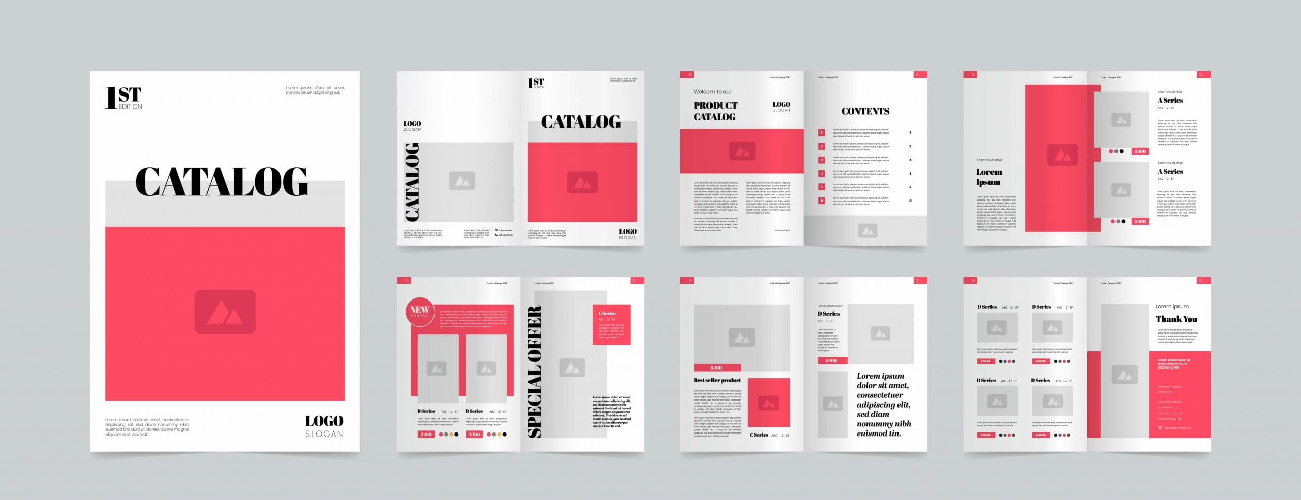
In recent years, catalog design has made a big comeback. While many had believed the advancement of technology would render product catalogs obsolete, that has not been the case. In recent years, more businesses are printing them.
This can be attributed to statistics demonstrating that three in four Americans become more interested in a retailer’s products after seeing them in a product catalog. The importance of catalog direct marketing cannot be underestimated, and it is highly advised that all businesses reconsider their positions on the potential of product catalogs.
How does one do an outstanding catalog design? What are the things to look out for? Read on to find out more about the dos and don’ts of product catalog design.
Do – Have an Attention-Grabbing Headline for Your Catalog Design
The headline will be the first thing a potential consumer will read when picking up your product catalog. It is therefore crucial to devise a catchy, attention-grabbing headline, rather than a boring one which fails to excite the reader. For instance, you can use superlative words to capture your reader’s attention.
Do – Include a Personalized Letter from Your Company
Including a personalized letter from your company’s founder, CEO, or President, is a good way to forge a personal connection with your potential consumers. Ideally, position it on the inside front or back covers. The content of the letter should emphasize your company’s commitment to providing the best quality products or services to the consumers.
This letter must be accompanied by a photograph and signature; putting a face to your company ensures a friendly vibe, rather than giving the impression that they are dealing with a soulless corporation.
Don’t – Provide the Product Description in the Headlines
A common mistake many retailers make is including the product description in the headline. This makes the headline become unnecessarily wordy, likely losing the attention of potential consumers. A headline should be short and sweet, yet catchy enough to entice readers to continue reading.
Don’t – Clutter Your Pages in Your Catalog Design
Many retailers try to reduce the cost of producing the catalog by cluttering a single page with many products. The result is that the products and font size appear small, putting off readers. This cluttered design is visually unappealing. If readers are turned off from going through the entire page for information, you will likely lose out on sales anyway, and the money saved from producing the catalog would be negligible, compared to the lost revenue.
Don’t – Forget to Include Your Company’s Contact Details on Every Page
It is highly advisable that you include your company’s contact details, such as email, website, and phone number, on every page of your catalog design, rather than only at the start or end of the catalog. This makes it easier for consumers to reach out.
Making things as convenient as possible for them means you will not miss out on consumers who might reconsider their decision, having spent much time searching for contact details.
If you or your company are looking to get your product catalogs printed, Dazzle Printing should be the first name on your mind. Our catalog printing services are one of the most affordable, and we do so without sacrificing quality or turnaround time.
We also provide free samples to all our clients upon request, which will give you first-hand insight to our print quality, before you make the commitment to print with us.


