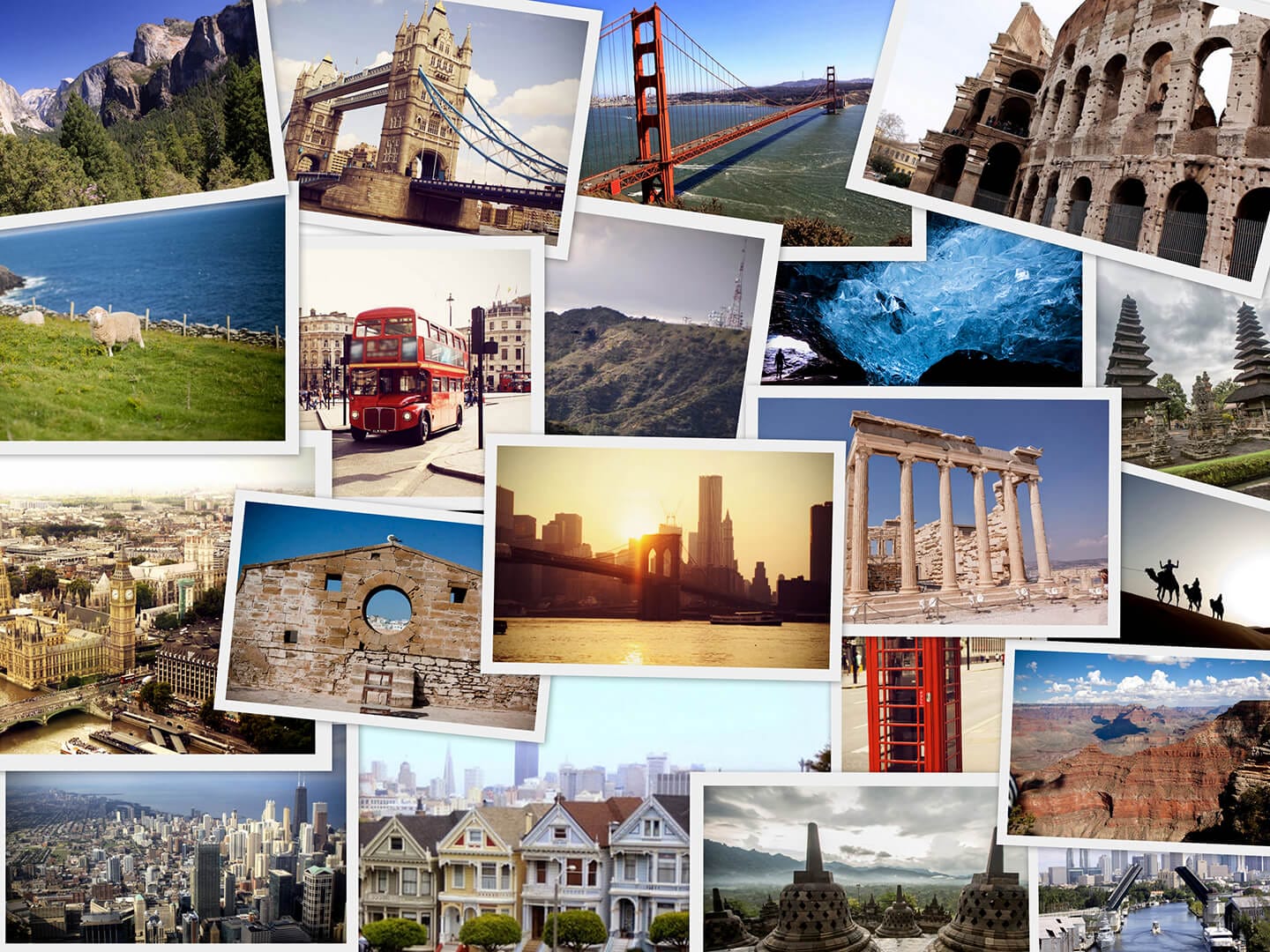
Postcards. When you think about postcard design, do you get excited? Ready to be entertained? Probably not! But believe it or not, deltiology, the study and collecting of postcards, is the third largest collecting hobby in the world, behind stamps and coins/currency (Source: The American Philatelist).
And it’s not just the collectors who enjoy them: some publications even post commentary on the bad postcards they’ve encountered.
For example, Michigan’s Mlive reporter Dave Murray has compiled several collections of dull and ineffective tourism postcards, to the dismay of each town’s residents. See the dull postcards here. There is also a tumblr account dedicated to displaying awkward, cringe-worthy, and often politically incorrect postcards from 1950-1975 here.
Postcard Design Tips
Even if you’re not as into postcards as those people, you are certainly aware of their marketing power – when they are done well. Whether you are promoting a new service, alerting the public to your changed office address, or just checking in, you know that direct-mail marketing is the most effective way to stay at the forefront of your customer’s thoughts.
But how can you avoid winding up on a blogger’s gallery of bad postcard design and unfortunate word choices? Or turned into a meme by a snarky teenager? It’s all about knowing the key guidelines to follow closely for postcard design:
- Keep it simple. The postcard design should be clean and clutterless, using the whitespace to ensure readability and focus on your main points.
- Clear, direct message. Use a bold, concise headline (and sub-headlines for additional text), highlight personalized offers and benefits, and include a call to action with your contact information.
- Prominent logo. The most beautifully designed campaign will fail if the customer doesn’t know who sent it!
- Smart color choices. The colors you choose in your postcard design determine the initial interest in the postcard, but should not take away from the images you include.
- Eye-catching and relevant images. A photo or graphic that reinforces the textual message in your postcard design really drives home the purpose of the postcard.
- Use a return address. A return address communicates to your customer that you are a professional company with a physical location.
- Customize it. Consider non-standard printing options to stand out in the mailbox. Use larger stock or a perforated edge for easy couponing.
A good postcard design blends all of those elements seamlessly. Your audience should be able to pluck it from their mailbox and be able to tell right away if your products or services are pertinent to them at the time.
If yes, you have a solid prospect! If not, an attractive, interesting postcard design goes a long way toward getting that postcard passed along to a friend or put in the “later” pile for when your service will apply to them. And last but absolutely not least, always proofread your copy carefully!
Need postcards printed? Check out our postcard printing services.


